-
Seeing fast is sometimes too slow
Humans have a remarkable ability to connect dots, extrapolate lines and build mental images of the world through vision. Faster than thought, most of the time.
Those features aren’t just ancient evolutionary facts from millions of years ago, they still work today. Sometimes the images appear fast, sometimes it takes a moment or two to have the brain connect.

This, spotted on a t-shirt. Took my brain a little too long to “see” image and ask for a photo.
Can you spot the animal that isn’t really there?
-
So I entered Iron Viz 2026
In 2023 I blew it. Wrong topic.
In 2004 I got it right. My Viz made the list of the ~200 finalists.
In 2025, how will I do?
My second, proper, Iron Viz entry is in. The title “What’s your Tipple”. All focused on the delicious world of cocktails and taking the viewer on a journey to find one, or more, for them.
What did I learn, too much to write here. I got a connected Beeswarm Chart to work, which means I got Beeswarm charts to work. I got the slick but truly tedious dashboard navigation to work – so one dashboard flips through charts, rather than having to change to different tabs. Tedious that is, hurt do my hands from all the mouse work.
I also learned a ton of charts as preparation and trials, the helpfulness and limits of ChatGPT in data. And I played with my vizology knowledge – the art side and the science side.
For the record, the viz. More learning to follow when my muscles recover.
-
100% Text Charts – In Action
Data viz turns abstract data into tangible insights. In my past post I shared an abstract how to make a 100% bar chart with text. Now, I’ve gone and made it real for you. [scroll down, its a ways to the bottom]
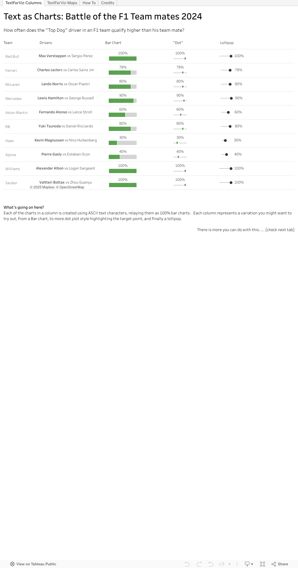
Check out the first tab, where I neatly line up a few examples for you. I took the bar chart idea and thought, what else could we do. Well, why not a Lollipop chart, or variation of. I reckon there are more neat ways out there – hope you will try some.
I popped the view onto a map, second tab, like a geographic overlay. Useful for things the same size, and if you don’t want to fiddle with charts a lot. This can be useful on maps and more.
And best of all, the steps behind the trick. You can see in formula windows the way to extract parts of the text character, then sneak into the text settings on the marks tab to change the colour. Once the colour is changed and the text strings lined up, viola, you have it.
Hope I’ve been able to make the abstract text to chart idea into a tangible for you. Download the workbook if you want to see and try the magic yourself.
-
100% Text chart, 80% easy
I learned a new Viz thing this week. Actually I learned two, but let’s save one for another time. What did I learn that has me so excited? I learned how to use text strings to make a 100% bar chart.
Ooooookkkkk. I hear you say. Isn’t the 100% a pretty easy chart to make, I mean, even in the spreadsheet programs? Yes, this is true – but they are huge, if you are pixel constrained. And fiddly if you need a few charts in some non standard ways. With 10 character, two colours you and a few calculated fields you can make a small 100% bar chart, that you can place around your viz. Add in a second line for the actual % number and you have a mini, spark line like 100% view.
Where can you use this. Well, let’s say you are positioning data on top of an image or map. You have limited space, and you really really really don’t want to just make 10 separate charts and manually size and position them as floating dashboards on top of an image. Use some text as the XY. How about in a long tabular style? Use some text. But it’s not just a drag and drop. I’ll be honest, the trick was hidden a bit – took two hours to find it. But there, in the text setup, was the answer.
So how do I think this works? Well, human eyes are good with length, but at 10 characters size, I reckon they don’t need to work if the bar is exactly 84% or 80%. So we can adjust a bit. Start with the % you want to share. Convert this to a 1-10 integer value, so it’s a value between 1 and 10. You might have to multiply up if your % is a decimal number, divide by 100 if it’s in 3 digits.
Then, we use some text that looks like ██████████ – which is 10 characters long. For the first part, the % to show, we use the integer value of the % to get the X left most characters. Then, we need another snip of text that is the remaining part of the 10, so take the right set of characters left – 10-% of what you have. Then in the text definition add the two text dimensions together, side by side, and set them to two text colours.
Let’s try with 84%. First , convert to integer so 84% –> 8. Then, we need 8 of the solid bars, or ████████. Then we have 2 left to bring it up to the, or ███. Let’s be positive that the first one is green, and leave the rest black. Put those side by side (not so easy in WordPress) and ██████████. Viola, a small 100% chart using text character.
Shout out to Tableau Pubic author Nhung Le, https://public.tableau.com/app/profile/le.nhung/vizzes for her very cool vis on Project Management . Follow her on Tableau Public if you like her work, or want to learn some more.
-
TC24: My 3X3 from the 2024 Tableau Conference replays
Tableau Conference (TC) 24 is over. I wish I could say I’d been but no. TC24 was in San Francisco, a very long, costly flight away, would involve some very off-putting customs procedures and kept me from family fun in LegoLand. Fortunately TCs are fantastic events for recording and sharing the information afterwards so a vast audience can learn and be inspired. So I’m checking out the replays at https://www.salesforce.com/plus/experience/tableau_conference_2024
What are my three favourite take aways from the event? My three favourite replays? My three favourite Public Viz for TC24? Read on.
Take Aways
1-Tableau Public Local Saving: This is gonna be huge. Now you can save locally, not only on the web, opening up data for those who are shy, those who will use data for something they consider personal. But those personal ones are the ones with the most passion, so people will be more likely to learn.
2-We are not alone in our insights not being used. Nice to see that shout out for the many many data analysts finding the insights, and not knowing if they are really making an impact. That it’s in the vision ahead is reassuring – anything that helps bring better decisions to the world is a plus.
3-Custom themes. A little boring perhaps, but for those working in a company, or seeking consistency, I think this will be really welcome. It’s something that is there in PowerBI, and I’ve seen how even a quick theme load makes a truly horrible dashboard better. Hope we’ll have a chance to use this feature in anger.
Replay Sessions
1-Design Dashboards for the Mind’s Eye. This one blew my mind. Truly amazing demonstration of the power of visual processing in the human brain.
2-Iron viz. Wow and tips to learn like crazy. Pata might be a newbie but up there on stage like a Viz Goddess. So many terms and examples highlighted as the build is ongoing through the event.
3-How to do cool stuff in Tableau. URL actions and filters – even answered question I had last week. And the online same sizing of the charts via WebEdit. Very cool presentation from the expert twins.
Public Vizs
The Tableau community is fabulous at sharing content, to help others learn and maybe, just maybe, show off a bit. Want to find a wealth of information? Go to the Tableau Public site, use the search bar and search for TC24, TC2024 or Tableau Conference 24 . Vis’s posted for the event, either as content or just in general will be returned. Happy viz surfing. My three favourites are
1-Hours of Sunshine – by Chantilly Jaggernauth. Lovely, simple eye catching viz for hours of sunlight. I like the way the regions are split with top and bottom dots. That can be applied in a few places I can think of now.
2-The Iron Viz – The IMDB Explorer. Just for the arc chart this is amazing. Learning to that will take some time but be hugely useful. Click at the bottom right to get to the arc exploration viz.
3-At the speed of Iron Viz . Check this out for the tips and tricks to make you faster and better. Works best with the Iron Viz video as you get some commentary on the techniques applied and why they can help you out.
That’s my 3X3 highlights of the Tableau Conference 2024 replays. One of my Viz hero’s, Paul Banoub, encouraged me to watch the TC replays nearly a decade ago. I encourage you to take in all the session recordings you can. You will learn, you will laugh, you may cringe, you will be a better vizologist for it. Enjoy.
-
Who knew microseconds took so long
It’s the start of the Formula One season. Lots of races for sports fans to enjoy, lots of potential data stories for those who like to viz out the F1 seasons. Such good data to play with.
So began the season and a comment I read from a driver about how “the cars are getting closer and closer in terms of time” stuck with me. After the qualifying session, I checked. And indeed, every car is inside a 2 second gap from pole position to the last. Pretty short times if you check out the link.
https://www.bbc.com/sport/formula1/2023/bahrain-grand-prix/results/qualifying
But what does that look like? So I though to plot it, use that length thing people are so good at to see if the gaps can been seen/understood better. Be fun, be easy since not much data and Tableau makes a Gantt chart well. Ohhhh was I wrong.
Seems that date functions in Google sheets, Tableau and others don’t handle microseconds well. Seconds yes, microseconds no. So some searching later, some other comments how bad its handled and I’m of with math. Ended up converting the time to numbers to handle the microseconds – so multiplied the seconds element by 1000 and worked with numbers, keeping in mind that the 1000, 2000 marks meant it was a new second. So math done, time to see it.

Got a reasonable view out in the end. The length shows the top 10 mostly grouped up together, some very very close drivers in terms of time, the inevitable large gap to Max Verstappen and clusters for the other two qualifying sessions. Added the previous year as well (same need to manually crunch, took less time since I know what to do) and you can see on the same track, for 20 drivers in 10 teams, they are indeed qualifying closer and closer to each other.
The remarkable thing, the whole top visual covers a span of under 2 seconds. The slowest driver in the slowest car is a less than 2 seconds slower over a lap (90 seconds plus) than the fastest. 2 seconds at nearly 200 km/hr goes by fast.
What next? Well, enjoy the F1 season. I might try to covert the time to distance to show in a different way just how close these cars are performance wise. And with lots of races, let’s hope for some interesting events in the season so each race generates some interesting data viz opportunities.
So, my tip for you. If you are going to work with short times, microseconds, be prepared to convert the minutes and seconds from time to integer numbers.
-
Six Books, yes books, you should read in the Year of the Dragon
Chinese New Year is here. A new year, a new mythological character. Why not make it a year to learn and read a book. Or six Six you say? Well it’s only two per month, two per 60 days, that will help you learn and make you a better vizologist. You can do it, they can even be online digital books from the library after all.
The Big Book of Dashboards, by Steve Wexler, Jeffrey Schaffer and Andy Cotgreave
The best practical book on my list that will help make your dashboards better. With a great opening segment on the theory of visual information. That section alone you will come back to. Then some solid before and after dashboards and the why/how they work for reference when you are building or improving on your work. And at the end a well referenced 4 page guide to chart types. Love this book, it’s one of my mot shared.
Learning to see Data, by Ben Jones
I’ve built a few great samples to showcase the value of visuals from this book, to great effect. This for me is one of those fill in a few gaps, refine what we’ve worked with for a while book. Its well suited to someone beginning, and a good on to come back to every once in a in while for tips.
How Charts Lie, by Alberto Cairo
This book was an eye opener. With a start on the mechanics and theory of a good chart. It reads a bit dry but is one of those items that lets you see better where a good chart is used, and where a bad one is. Then into the details on perspective, and how commonly viewed charts can be so wrong – whether maps, lines or weather. A good read, and some great online viewing as well.
Practical Tableau: 100 Tips, Tutorials and Strategies by Ryan Sleeper
A lot of how tos. How to make a waterfall chart, a Pareto and more. For me, it’s how to get the most of Tableau, certainly in 2018 when this came out. If you use a different tool, look for a good set of how tos for that to up your visuals.
Storytelling with Data, by Cole Nussbaum Knaflic
Work or present charts and dashboards enough and you realize you need more than a cool, well constructed chart to make your point stick. You need the information to make a story that sticks with your audience, one they relay again or even better, take the action you recommend. How to do that quickly, check out this classic on Storytelling with Data. How to package that story onto just the space of a chart, with the right focus on data, the right use of text and annotation a truly valuable lesson from this book.
Effective Data Storytelling, Brent Dykes
Taking it up a level, this book if for you to get into a solid story across a whole dashboard, across a prevention deck or lie presentation. There are some solidly practical ways to improve charts. Two well used tips for me – the charts you use to find an insight are not the same you use to present the insight. How many times I’d I get that wrong in the past. The other, how to setup a story in 4 parts. I won’t give that away here, happy reading to gain that golden nugget.
Full disclosure, I have read all these books. I have them in physical book form. I refer to them often and I share the widely with people I work with who want to learn more about Data Visualization. They elegantly combine theory, practical and entertaining tips throughout that will help educate you, and make you a better vizologist.
Best give me a bit of time to the next post. I think I should go re read one or two of these and brush up my own skills.
-
So I entered the Iron Viz challenge
I did it. After years of doing vis for fun and for work, I finally took the plunge to do one for the Iron Viz competition.
What the heck is the Iron Viz? Well, in the Tableau community, for some time, there is an annual competition to see who can craft the best viz, on stage, in 20 minutes. It’s modelled a bit after a cooking show competion, and there are some wildly interesting things that go into the various Vizes. There are also, if I’m honest, some entries I’ve seen that I’m sure I could do. Sooooo, this year I did.
The challenges were many.
Finding Focus Time: October is a long month, but somehow packed with events, work events, family events, get out and meet some people events, the regular weekly events that already consume a lot of time and, if I’m totally honest, some streaming events on Disney plus to catch. Oh, and I work like so many do, commute to the office too much for questionable reasons, have two kids to take care of, haven’t given up on regular exercise or getting enough sleep to be functional.
Choosing a Topic: I started trolling my brain for fun topics once I heard about the challenge, and saw its open to those in Singapore this year (previous years it was not, which slowed me down a lot). One topic I’ve had on the mind to viz is, as my tittle might be, “The Rise of the Bullies”. I figured some democracy rating data, some look over time and certain less savoury world leaders, some line and gantt charts and there might be a story. But no. So it mulled till late in the month, when I next thought about using the Economist’s Burger Index as inspiration to compare inflation. The data was there, I was sure, the idea approachable. Onto the quest for …
Useable Data: With a topic in mind, I could get the data for the Big Macs, and thanks to the awesome Economist index (full disclaimer: I am a passionate, multi-decade reader of the Economist) which posted not only the latest online, but data going back more than 20 years. Oh yeah. But then the inflation side, how to get that. Why do some countries have it twice a year, why can’t I find a set that lines up the timing? Why does a great dataset from the IMF miss out on certain countries that both have Economist data and lots of McDonalds to make the data better. Let’s just stay, and you may know the feeling, some data wrangling occured. Then…..
My Data story went wrong: As I pulled the freshly wrangled data together, had some cool text snippets and charts from varied sources getting ready to tart up, as the data got visualized, the story failed to materialise. I had a bunch of LEGO like pieces of a story to go, but the data did not support the story. It wasn’t bad, but it was far far far from being a good story to tell. And given I have a thing about accurate data, I could not post something about how BigMacs can tell you about inflation for about 2 countries, on about 1 period of time.
The clock still ticked however, the month end submission time approached and my stubborn “I can do this” habit remained strong.
In the end I went to some work from earlier this year that has a more compelling story, an easier dataset to work with, and looked not too bad to start with. I’ll save the detailed mechanics on that vis (since it uses some good Vizology techniques) for another blog. Suffice it to say, I made it better. I made it tell a better story, it got through my checks and I took the plunge to put it out there, to fill in the entry form and submit a Viz for some mysterious judges to evaluate (scary) and maybe the world to see if it qualifies or moves further along the process (also scary).
What did I learn, to share with you?
Start Early: Always keep some topics in mind to explore, try things out and keep work even that is in draft for a while. A month, where you are busy, flies by so fast.
Practice: Being able to work with charts, visuals and colour combos quickly is important, not only at the last minute. It lets you pivot well if the data story is nor materialising, and to assemble a good looking starting point to polish.
You have to try: No one ever won a competition they didn’t enter. There is no way I’d ever get anywhere in Iron Viz, or other challenges, without the step to at least enter. We are all our fiercest critics and that vis you think might be just ok, is likely magical for many others. Have confidence, make the effort and enter.
Keep Learning. Keep Trying
ps: Shortly after this post I learned to Read and re-read all the rules and FAQs. Alas I missed out there being a particular theme to the contest (in my defence, the theme is down in the FAQs, not in the general descriptions) , and my story was off the mark. My bad, but learning lesson.
-
Castle Charts and Height Inflation
I recently enjoyed a trip back to Japan for some great food, family fun and the occasional historical adventure around the Tokyo area. We stopped at one place for some history, Odawara Castle, in Kanagawa. This castle is often on the list of things to see, partly as it’s a short Shinkansen ride away from Tokyo and , as I learned, it’s fairly historic and one of the tallest in Japan. History wise, it played a role in the 1500s consolidation of Japan being the last major castle to surrender to Toyotomi Hideyoshi. Height wise, as advertised, it’s in the top 10, number 7 in fact. [total side note, nice to know I’ve been to 4 of the 5 highest castles]
Yet the viz eye in me spotted a small problem. Overall it’s a good chart representation- scale at the side but without much overbearing numbering. Good visuals of the castles to attract the eye and a precise and consistent height out to one decimal place for all. The lines on the Y axes are not over bearing, and use gradient and size well between the 10m and 5m increments. All good so far.
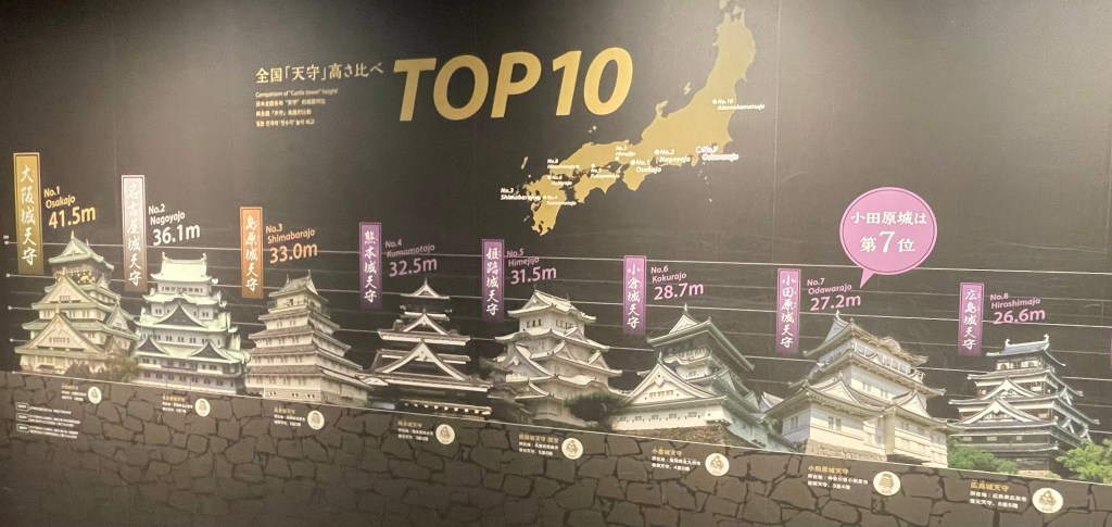
Castle Chart But look closer, really close, at the Y axis lines, for the star castle, Odawara. Listed at a 28.7m height. Doesn’t that very top top of the castle look to be over the 30m line? Pretty close between position 6, 7 and 8 on the charts, yet there does appear to be a bit of Castle Height Inflation going on.
What do you think? Should they redo some graphic sizing to be Viz chart accurate with the axes and all? Or leave it be – it’s telling a story and a little artistic license surely is allowed in your Castle Chart.
-
Bad Chart, Better Chart: Pie – 1
It’s been said before, many times. It will be said again, many times (likely by me) that a Pie Chart is a poor way to represent data. As humans, we are not well evolved to easily and accurately compare the differences in area. This in contrast to how we handle length, where we have a great ability to discern small differences in the length of what we see.
So they start off weak. They then take a turn for the worse in the many ways our computers now let us manipulate them. It’s way too easy to add a bunch of data to a pie chart – exploding the number of slices. Add in colour thanks to a drag and drop and those explodes slices are now multi coloured rainbows (if you are lucky), a wheel of colour death if you are not.
We can use the chart type for evil even more (whether intentional or unintentional) by adding in values that exceed 100%. A pie chart really can only show you the portion of a whole, so when you add in values of percent that add up to 100s of percents, with all those colours and slices, it makes the head hurt.
So they can go wrong. They can though help tell a story. If you don’t need a kaleidoscope of colour or more slices than clouds in the sky to make your point, there is hope for a pie chart (and if you do need the slices and lines, you need another chart type, or more than one).
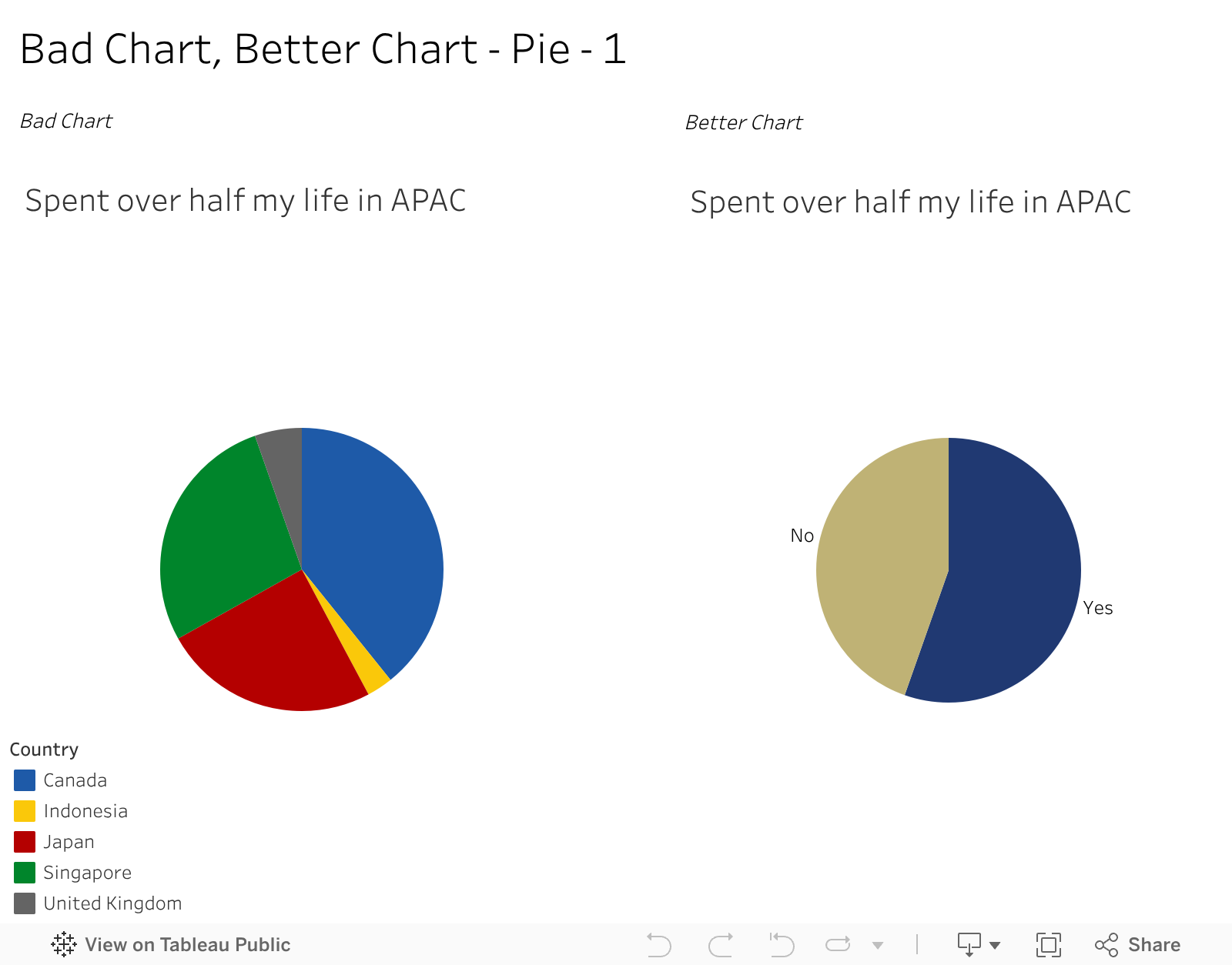
An example of one I might use for effect. For context, I was born in Canada but spent more than half my life in Asia Pacific How can I easily explain that to someone? Well, I do keep data and have some charts as above – one on all the places I’ve lived and about for how long. And one on the right on how much of my life has been spent in Asia. I would never subject anyone to the multi slide one except for educational purposes, yet the two colour one could fit a visual resume or presentation. It says, and only needs to say, I’ve spent more than half my life in Asia. I don’t need you to know if its 55.2% or 54.7% , nor where those years accumulated. Just that simple bit of a story.
And for that, while pie charts are less than great, I think the one on the right is a better chart than where it started.
-
Subscribe
Subscribed
Already have a WordPress.com account? Log in now.
