-
Pre-attentive Attributes: The Dashboard
Ok, I did it again. I made all the pre-attentive attributes into a dashboard as I veered slightly off track making the baseline data view. I started getting ready to make the first post looking in depth at features, but then the one data viz turned into another one, then another, and another. So I kept going in the flow to almost accidentally make my own reference copy of the pre-attentive features.
I also added a bit of interactivity to it so you can move around (for some) the key feature you want to highlight – like the size, colour or orientation indicator. It also moves the longer and wider bars, just works a bit slower.
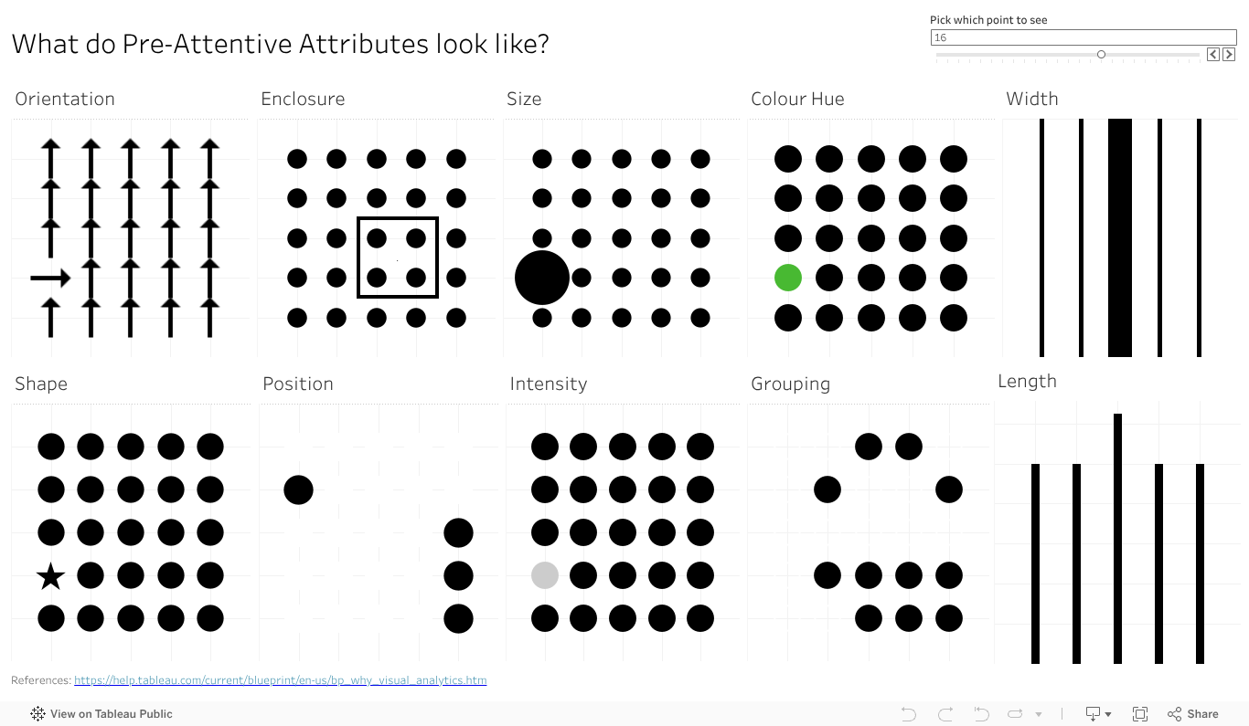
Give the dashboard a play, give it a screen grab to use in your presentations if it can help you With a bit of work I could likely give you some options on the colour (that one colour dot).
Something else that will make this more visually compelling and helpful? Let the comments know.
-
Pre-attentive: Shapes
Can you spot a square in a sea of circles? Or perhaps the stop sign in the deluge of visual information that is city driving? That octagon shape, along with the red, makes it easier to distinguish that important road sign from the billboard, the sign board, the ad for your favourite coffee shop and that traffic light just about to turn red.
But what can we do with that in data viz? Well, you have a few places of course. A shape change to highlight a key point in a cross plot, so long as it’s not too dense, can help you grab people’s attention without changing the colours.
You could have a bit more fun and us the shape element on a lollipop. No, not the kind that you unwrap and suck on, with oh so yummy Coca Cola flavour. No, the lollipop chart – where you typically have a circle atop a narrow bar chart style graph. If you want to limit colours, but still draw in the eye on a particular element, why not change the shape at the top to stand out. Make it a triangle to highlight the one you want. You can use this to add more data in a view , as the lollipop will naturally play to the length pre-attentive feature, so you can have both the ability to showcase the top items fast, and the one you are focused on in relation to them.
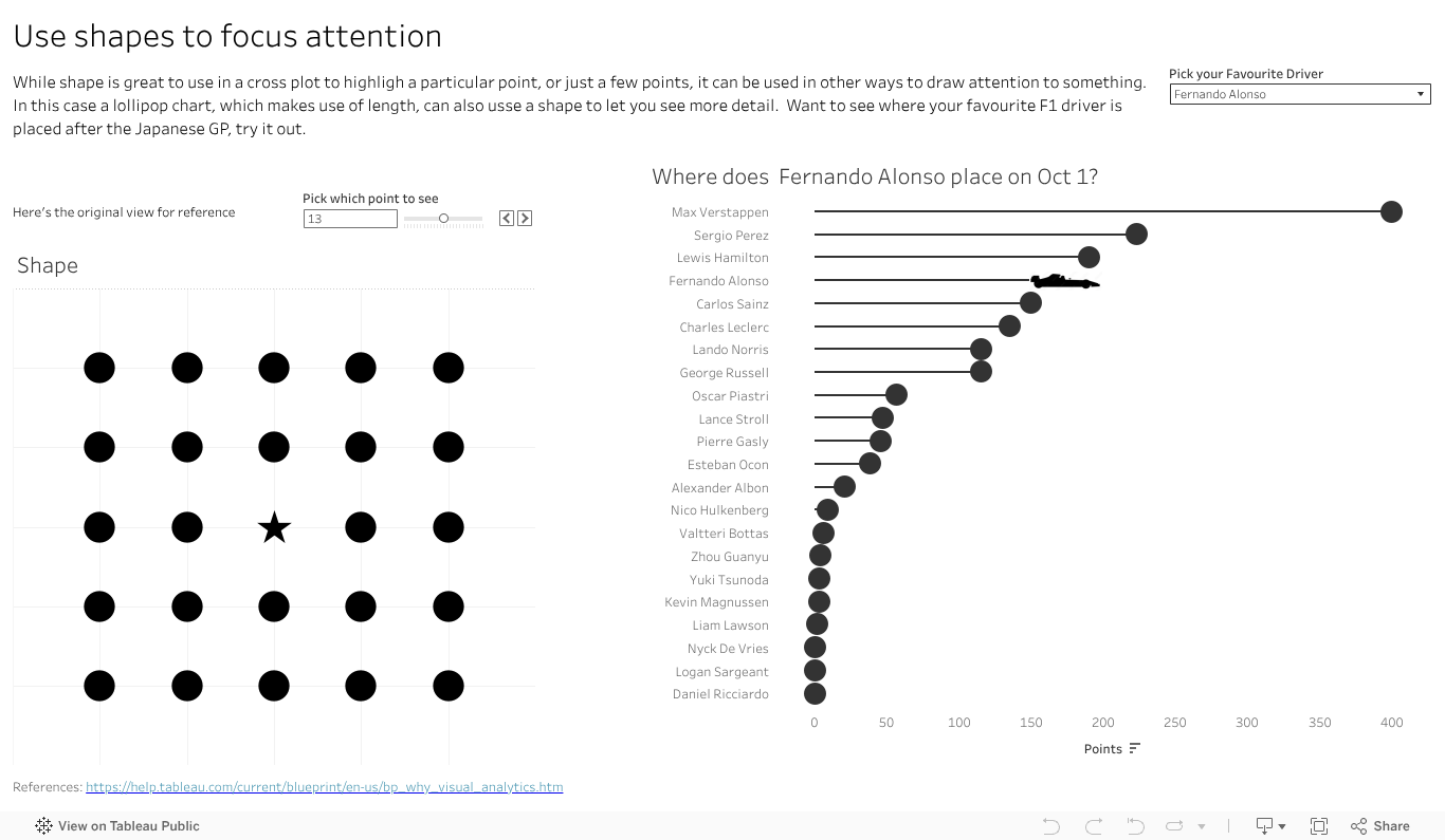
I’ve done that with an F1 vis. In 2023 Max has run, well sprinted at record pace away, with the total points for the year. That said there are some interesting battles further down the field. How is Alsono doing? Check out the car shape to fin out. How about newcomer Patrasi?
Length and colour traditionally get the attention in data viz, with bar charts and palettes of so many colours to choose from. Don’t forget the idea of shape in your next dashboard or analytics. Maybe it has a way to grab your audiences eye and inject some novelty to help you make your message stand out.
-
Pre-Attentive: Length
Why do bar charts seem to be everywhere? Why do they work so well? Perhaps the easiest of features to talk about is length. Humans have developed eyesight to tell the difference in length to a very granular degree. We can see and interpret quite accurately very small differences in length, and the relative proportions between them. Even a small percentage difference is visible to the human eye, making a chart that employs lengths a powerful way to communicate.
Max Verstappen is a Formula One driver, who really pushes hard to win. Why does Max always want to win the F1, not come second? It’s more than just data of course, there is an innate passion to win and be number one. Data, and our attribute, can give us a sense of why 1st is sooo much more valuable than second.

Which do you like more? A bit of text showing the points and positions? Say
Position: 1. 2. 3. 4. 5. 6. 7. 8. 9. 10.
Points. 25 18 15 12 10 8 6 4 2 1
Or the charts as above, showing the points and relative scale of each? I reckon the chart has the impact.
So if you have a point to make, a huge (or small) difference you need your audience to see and understand, reach for a viz with length.
-
Data Viz at the Speed of Thought: Pre-attentive Attributes
Do you want your data viz message to reach your audience fast? Want it to get there almost faster than the speed of thought? Dig deeper on a human ability known as pre-attentive attributes.
Just what are they? Why are they there? The why goes back to evolution, when humans didn’t use tools to make charts or navigate the world, they used eyes and experience. And dangers were not limited to 12 slice Pie charts attempting to depict a startling conclusion. Long ago the features let you navigate the world, find the food you needed and avoid the predators that wanted to make you into food. Motion, super easy to see. Bit of the right colour or shape (of say fruit), useful to see. Distilled down for a more modern world, the attributes are ways to organise visual information – not just data but anything – in a way that will bypass conscious thought to be understood in the brain. Needless to say they have huge implications in data viz, but I’ll offer a shout out to Datasaurus-Rex for designing a CV format with pre-attentive attributes in mind.
What do they look like? Commonly shown in the below image, this one borrowed from https://help.tableau.com/current/blueprint/en-us/bp_why_visual_analytics.htm. You can read more there, as well as out ever reliable source of information, Wikipedia https://en.wikipedia.org/wiki/Pre-attentive_processing.
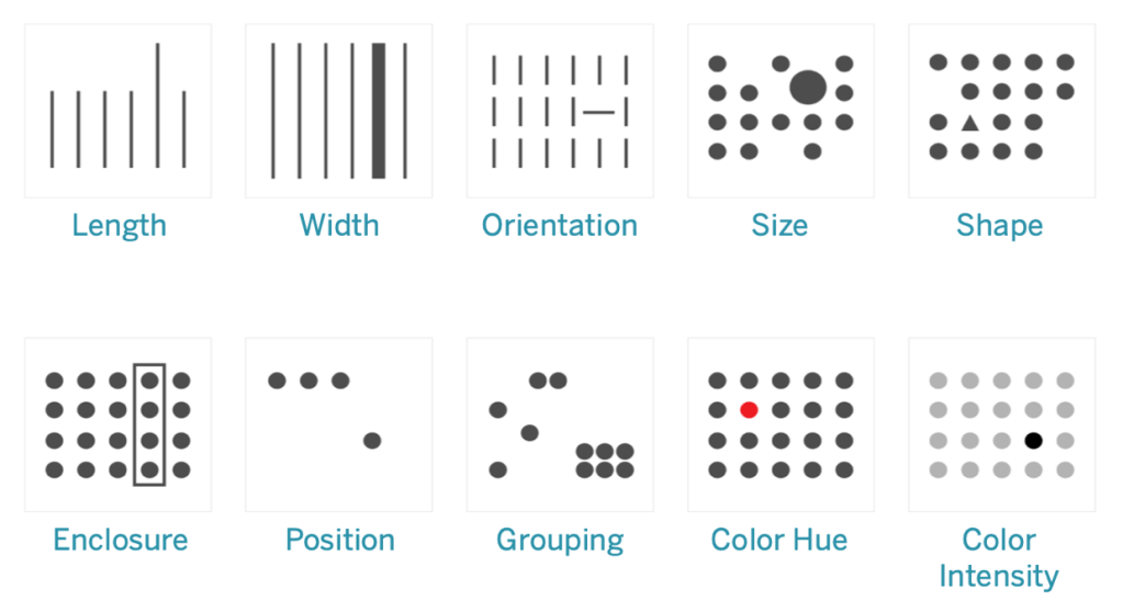
Ten attributes above – looks like an ideal time to start a mini series on how how you can apply the features in data viz, and beyond. Stay tuned as I delve deeper into the features, build up a viz to showcase them all, add details on how you can use each of them in more detail. And of course add some interactivity , after all what’s a data viz without the ability to interact and explore?
As a teaser, a good sample I came across on Tableau Public for you to see some features in action, start your inspirations and ideas flowing. https://public.tableau.com/app/profile/jason.knudson/viz/Pre-AttentiveAttributes_16558437991060/Pre-AttentiveAttributes
Got a favourite feature in mind from the above 10 you’d like to see. Drop a comment on the name to bump it up the list to work on.
-
Shout out to a very cool climate Viz. Great minds thinking alike?
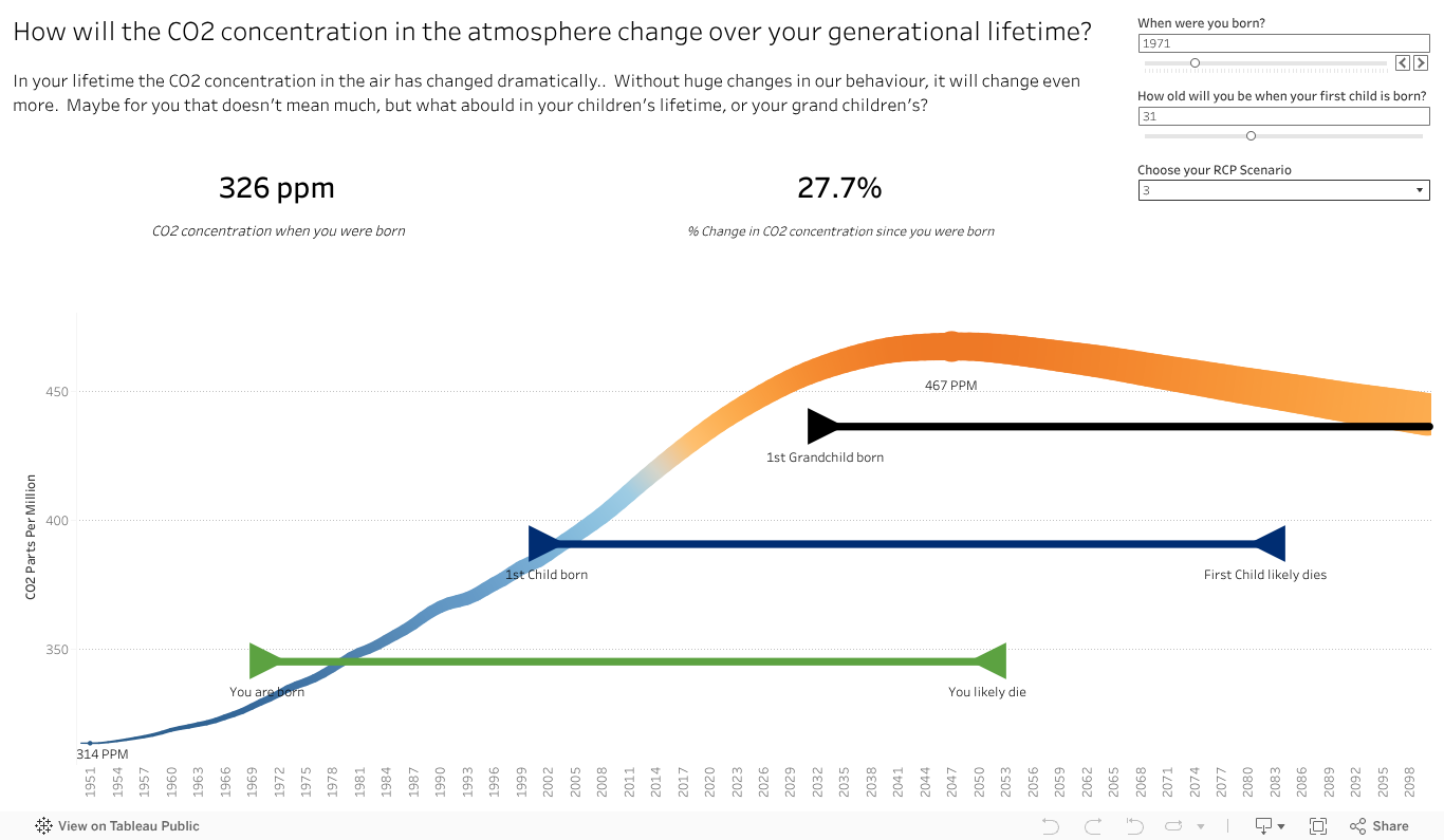
I started working on a viz a while back, inspired by a print version in a book called Nomad Century. It showed the change in CO2 in the atmosphere from the authors lifetime perspective, with a view to future generations. I liked it. So I took it and ran with it to make it more interactive and specific to my view. Interactive so people could choose their relative ages, make some assumptions on lifespans to look ahead at, and choose from some of the various climate perspectives forecast. I like to make things interactive so people can play and explore the data, and as a father, this was one that could show me more of the future perhaps than a number for CO2, or mere words.
It took a while to get the data, it took longer to get a view that I was semi happy with to show what I wanted. And what I wanted to show was the life cycles of three generations, yourself, kids and grandkids , to show the climate impact forecasts, the scale of change that has occured over a lifetime and to let people see where the climate impact landed on different scenarios. I wished I could show the temperature forecast over time, but made due with the CO2 concentration.
Fiddling along, I managed to get a Gantt chart style view for people, and the line for CO2. As the title betrays, it’s far from what I want to be as a completed viz(super draft is not even 1st draft). I’ll share it here because……
A while after I stopped playing with the viz, to tackle some others, a very similar and better done viz was released with the IPPC 6, You can see it here, and the full link below.
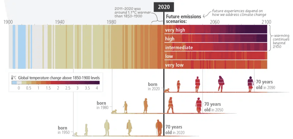
I love how they added the icons on the bar to show the ages. I like my timeline and its ability to personalise, but it lacks impact. I love their ability to make it more human with the images over time. The climate bars, showing heat from historic benchmark, and the different scenarios at the top right bring home the point that unless we reduce drastically, it’s going to be hot for our grandchildren. To me it’s not quite there yet. It’s missing still something, like mine, to connect the increase in temp/CO2/colour bar to what it means (sea level rise, droughts etc). That said, it’s a great viz and I shall certainly look to borrow those icons for people.
Stay tuned for another version of my viz on the climate change. Getting people to think beyond their ages is important to making change and I can’t help but feel there is more than one way to viz this.
That said, felt very happy to see someone viz something in a similar way. I’ll take that as a complement for (at least hoping to be) great minds thinking alike.
Below the link to the full story, including the viz used above.
-
CO2 Flavoured Lillipop
How much CO2 per capita does your country emit? Perhaps you’ve seen some data or story about CO2 per country, with some high and some low. I bet it come up as a number, or a bar on a chart, or maybe a bit of both. This week that scenario happened to me – a number in a bar, with lots of other bars around it. But what did the number mean? How could I relate it to something? Or compare with other countries?
So I took that idea and ran with it. After a bit of data collection, a way more manual and harder process than I care to admit here, I had my data ready. Country, C02 per capital number, a way to relate to size (like 2 tons = a big car). A data connection and a few viz attempts to get the look better and data text more viewable, I created….

So what’s in there, from a vizology view?
- Eye grabbing title which uses a parameter to include the country selected, making it more personal.
- The question to ask of this Viz, and in this case it helps setup why we are comparing a number to a size.
- A lollipop chart to give a different view. I love these as I can change the “treat” at the top to do a few things. In this case I’ve taken the number away and given it an object to relate the emissions to a real thing. 5 tons is not an easily imaginable number. An elephant is.
- Added some, but not too much, colour transition in the tops of the lollipops.
- Broke the stem of the lollipop out with country level detail. I love being able to do this in a bar chart, to see what makes up that detail.
- A control to let you select a country, which then makes it visible in the chart, makes this interactive and more specific to the users. I personally like my viz’s to be interactive and let me explore.
- Colour coded the country selected so you could easily find out where it is on the chart, to see its emissions and peers.
- Tool tips to tell you more of the story, without the clutter, so if you hover over the chart you gain more insight.
- A page with my source data – you do have to download to get that at the moment to keep this clean. I do think its important to record your sources if you use, inspirations and any complicated logic you use.
What might I add next? A bit of a guide to what you are seeing. I know where to find things however it may not be obvious to everyone that you can hover over for tool tips, that the size of the lollipop could relate to number of countries in that list and I would love to change the circles to an icon of what it relates to for added punch.
Hope you will have a play around with it, see the different countries and try some of the tips mentioned. Took about 30 minutes viz effort to create, was a bit of fun and something I’m happy enough to share. Typing up all those tips involved in making the one viz, looks like a whole new set of blogs to develop to explain each in more detail. Stay tuned.
-
Better Colours, and a Blog learning
Always learning is a good thing. Here I’m learning a bit more about Vizology with each post, I hope you are as well. And I’m learning on the blogging – how many little viz things go into a viz(so lots of updates) and today how things can get ahead of myself. In my excitement to have the Tableau viz’s up and how much fun they are to do, it seems I missed a step in the build my tracker story.
First, the colours. If you recall back before the BANs post, I talked about a waffle chart to track my posting process, that it showed orange and blue squares for viz and blog posts. I also said colour is important, which is true, What is next, step 2 if you like, is to use the colours and formats better to see.
I do love the default Tableau colours, they are good for differentiation, they have more experts than just me making them, are well thought out for the colour blind and they make it easy for me to see where a chart or dashboard was done in Tableau. But if we are honest, the blue and orange are a little strong. And I’m not really tracking on what type of post I make – the effort is to get me posting enough. So perhaps it can improve, which is what I did in version 2. What did I do to make it a bit more eye grabbing?
- Custom Palette: Default is great, having your own colours better. So I applied one of the schemes I like in Tableau to my viz. Better for my eyeballs, gives a bit of constancy and branding for me and helps the viz stand out.
- Both Blog and Viz posted to Green: Green is good, posting is good, and I want to be positive in the achievements. Both are now the same colour, which actually tracks the data I want – 36 posts. Not how many of each.
- Less chart junk: Removed a few of the background lines on the waffle chart to tidy up, make it friendly on the eyeballs. More on this in the future, for now you can check out a video from one of my DataViz Heroes Datasaurus Rex
- Grey for the undone: The incomplete items are not the focus, so I turned them to a light shade of grey. You can still see the part to the whole view of the waffle chart, just now the focus is on the good (done) part
With those changes, how does it look?

Hope you agree that looks a lot better than version 1.
As to what did I learn about blogging? Well, perhaps I need a better editorial plan for the posts. I’ll admit to being bad at check lists personally and that I keep learning material to post as I’m in the flow of making a viz or post so its hard to know the full plan with I start out. But a plan that forms or gets amended in my head has the weakness of staying in my head and thus getting lost in the flow. As in this case, I got so excited with the final form I jumped a step. So my take away from this post – write down somehow (mindmaps I’m thinking of you) all that I want to say for a Viz series so I don’t jump ahead too often.
I can’t promise perfection, I can promise to learn and be better. Wish me luck.
-
BANs
What are BANs? Are they a way to get banned from Twitter? From the movies? The coffee shop?
No , they are some Big Ass Numbers. They should be BIG, they should be numbers and they of course should support your data story and viz with meaning.
For some views and dashboards to communicate, you may have a few key datapoints, call them KPIs or OKRs if you like. They often represent a headline concept, or key piece of data someone (or everyone) in your audience wants to see instantly. Don’t risk them being missed in a chart – though a chart that can answer any why question is useful. Put them up front and Center, and big so they can see.
Made money in the quarter – BAN. Beating the SLA – BAN. Website traffic down – BAN. BAN the numbers in a highly viewable way to answer the first question that your audience cares about.
How do I apply, lets check version 3 of that tracking sheet. My waffle grid is cool, it has the numbers there to see and a pattern that helps a viewer make a very quick percentage completed assessment. But it also makes you do some mental work, if say you want to know the exact %, or just how many posts have been made. Let’s BAN those for ease of use, they might be the info your really want to see.

There we go, once I post this post and update the data, I’ll have a bit more progress, which my BANs will give me a super quick view I need. I can use the waffle chart to see things, approximate the postings and progress – believe me, there will be a great sense of satisfaction as the squares all turn green (more than just the % number going up).
So many more ways to improve a viz exist, however I think its time to start off a new series. I’ve learned lots posting the first set – like how much goes into a simple viz to share, that I’ll try out a series of posts along a theme and build like this to tell the story, make the topics digestible bite sized posts and that I will likely need to keep the different Tableau dashboards and data separate for each one, to avoid updates messing up an early post.
Give BANs a try on your next viz, comment below how they go.
-
Should you care about Viz Colours?

Green does not mean stop. People trust blue. Italian sports cars come in certain colours for good reason – to create emotional reactions and experience. Colours around the world, around you, all have meanings and importance. Getting them right in a Viz can make the difference between meh and wow, even out to whether your audience understands and sees the key insight you worked so hard to bring to life.
What does Blue mean to you? What do you think of? The wide open sky? Certain brands or products that captured blue in our imagination? Trust may come to mind, which could explain why so many banks have blue logos. What about robin egg blue?
Or #81D8D0 or R:129 G:216 B:208 . to be exact.
Tiffany’s come to mind as having captured that colour? Knowing and applying colour theory to your viz can grab attention better, and make you more aware in case you are targeting an audience of a different culture – you’ll learn more about them and their culture and you’ll know more about colours.
What if you viz’d and people couldn’t read it? What if you didn’t know that nearly 8% of men have some kind of colour blindness that changes the way they interpret colour? – It could even be you. Knowing that there is a small but non trivial group out there that can’t see some red/green combinations should make you skip those as your primary colours.
What if you wanted to stand out? Or have your own personal brand and style? Wouldn’t you want to include that in your viz , more than just a little logo at the bottom? Personalising the colours that works for you, or if you are making them for another person/company/entity, making it more fun, more yours and something to stand out from the default crowd.
Need to practice that a bit and working at a company? Be sure to always use the company or corporate colours in your work viz’s. It may sound a bit boring, but the corporate colours often have a lot of thought put into them, to contrast well, to accommodate the colour blind and to send the right message about the firm. Having your viz, which may be dashboard or copied into a powerpoint deck or blog, in the same colours as the rest makes you look that little more professional, that little more consistent and memorable for the right reason (insight) not the wrong one (jarring colour combination in materials that made people look away or reach for sunglasses).
So grab that colour, well the RGB or HEX value of your colour. Get a photo with the colours you think pop and you want to use. Come back soon for another blog on how to get the colours you want, from photos, complementary, contrasting or just triangulating. And take a moment to look at colours in your viz to give it a bit more meaning. It sets you ahead of the crowd, which is where you want to be.
ps – you rarely see the blue orange default colours on Tableau Public’s Viz of the day
-
The First Viz
What better way to start a blog about Viz than with a viz to help me make regular updates to hit my goal. One of the many reasons I love Vizology is its ability to make change happen – in this case its meant to make me post content and visuals for you, establish a cadence and see progress.
So I’m going to start with a mini Waffle Chart. This chart shows parts to a whole – like a completion rate, how much of the total is done (or not done). Visuals like this are good for a quick approximation of the progress, not the exact percentage done, and would not be good for comparing two or three things together.
Since I aim for biweekly posts, and ten viz’s this year, that makes an even 36. Thirty-six is a 6 by 6 matrix which is helpful in making a square Wafffle chart. I’ve gone with Tableau for that visual, given its ease of use, the ready availability of a site (Tableau Public) to create, host and share content and its an awesome tool. More on that later.
Below, embedded if all is working, is the first version of the viz. A 6 by 6 grid based on manual dataset, where I tick off if a Blog or Viz as I post in a Google Sheet. I left this in the default Tableau colours for now, where blue is a blog, orange is a viz and grey is yet to come.

You can check the link out by clicking, even download the Viz to see how it works. It’s pretty easy – dataset that includes the rows and column value, and a datapoint beside each. You can take that further with calculated fields, multiple data columns, changing the size to say 10X10 which shows percent completion better. You can pull this off in other tools, a grid on Excel or even a table in a word processor. The idea is to share a visual that imparts a quick sense of progress at a glance.
As for me, the visual is there to keep me motivated to publish and share more. Visit again in a week or so, see what’s new/
-
Subscribe
Subscribed
Already have a WordPress.com account? Log in now.
