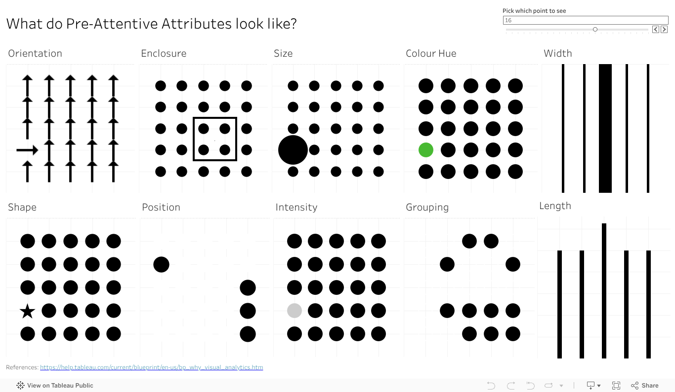
Ok, I did it again. I made all the pre-attentive attributes into a dashboard as I veered slightly off track making the baseline data view. I started getting ready to make the first post looking in depth at features, but then the one data viz turned into another one, then another, and another. So I kept going in the flow to almost accidentally make my own reference copy of the pre-attentive features.
I also added a bit of interactivity to it so you can move around (for some) the key feature you want to highlight – like the size, colour or orientation indicator. It also moves the longer and wider bars, just works a bit slower.
Give the dashboard a play, give it a screen grab to use in your presentations if it can help you With a bit of work I could likely give you some options on the colour (that one colour dot).
Something else that will make this more visually compelling and helpful? Let the comments know.
Why do bar charts seem to be everywhere? Why do they work so well? Perhaps the easiest of features to talk about is length. Humans have developed eyesight to tell the difference in length to a very granular degree. We can see and interpret quite accurately very small differences in length, and the relative proportions between them. Even a small percentage difference is visible to the human eye, making a chart that employs lengths a powerful way to communicate.
Max Verstappen is a Formula One driver, who really pushes hard to win. Why does Max always want to win the F1, not come second? It’s more than just data of course, there is an innate passion to win and be number one. Data, and our attribute, can give us a sense of why 1st is sooo much more valuable than second.
Which do you like more? A bit of text showing the points and positions? Say
Position: 1. 2. 3. 4. 5. 6. 7. 8. 9. 10.
Points. 25 18 15 12 10 8 6 4 2 1
Or the charts as above, showing the points and relative scale of each? I reckon the chart has the impact.
So if you have a point to make, a huge (or small) difference you need your audience to see and understand, reach for a viz with length.
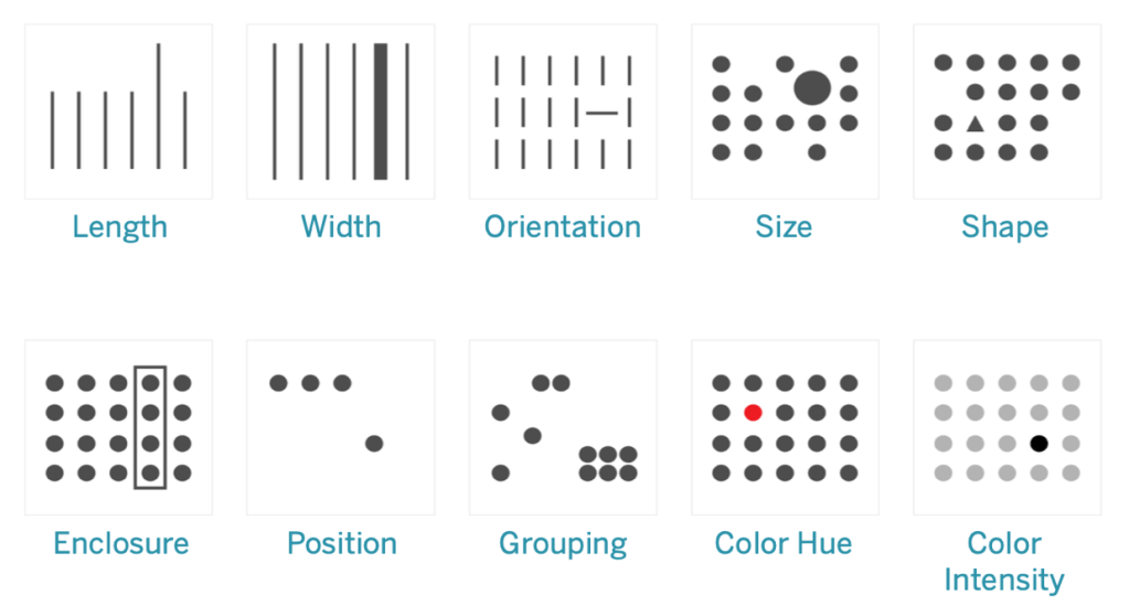
Do you want your data viz message to reach your audience fast? Want it to get there almost faster than the speed of thought? Dig deeper on a human ability known as pre-attentive attributes.
Just what are they? Why are they there? The why goes back to evolution, when humans didn’t use tools to make charts or navigate the world, they used eyes and experience. And dangers were not limited to 12 slice Pie charts attempting to depict a startling conclusion. Long ago the features let you navigate the world, find the food you needed and avoid the predators that wanted to make you into food. Motion, super easy to see. Bit of the right colour or shape (of say fruit), useful to see. Distilled down for a more modern world, the attributes are ways to organise visual information – not just data but anything – in a way that will bypass conscious thought to be understood in the brain. Needless to say they have huge implications in data viz, but I’ll offer a shout out to Datasaurus-Rex for designing a CV format with pre-attentive attributes in mind.
Ten attributes above – looks like an ideal time to start a mini series on how how you can apply the features in data viz, and beyond. Stay tuned as I delve deeper into the features, build up a viz to showcase them all, add details on how you can use each of them in more detail. And of course add some interactivity , after all what’s a data viz without the ability to interact and explore?