TC24: My 3X3 from the 2024 Tableau Conference replays

Tableau Conference (TC) 24 is over. I wish I could say I’d been but no. TC24 was in San Francisco, a very long, costly flight away, would involve some very off-putting customs procedures and kept me from family fun in LegoLand. Fortunately TCs are fantastic events for recording and sharing the information afterwards so a vast audience can learn and be inspired. So I’m checking out the replays at https://www.salesforce.com/plus/experience/tableau_conference_2024

What are my three favourite take aways from the event? My three favourite replays? My three favourite Public Viz for TC24? Read on.

Take Aways

1-Tableau Public Local Saving: This is gonna be huge. Now you can save locally, not only on the web, opening up data for those who are shy, those who will use data for something they consider personal. But those personal ones are the ones with the most passion, so people will be more likely to learn.

2-We are not alone in our insights not being used. Nice to see that shout out for the many many data analysts finding the insights, and not knowing if they are really making an impact. That it’s in the vision ahead is reassuring – anything that helps bring better decisions to the world is a plus.

3-Custom themes. A little boring perhaps, but for those working in a company, or seeking consistency, I think this will be really welcome. It’s something that is there in PowerBI, and I’ve seen how even a quick theme load makes a truly horrible dashboard better. Hope we’ll have a chance to use this feature in anger.

Replay Sessions

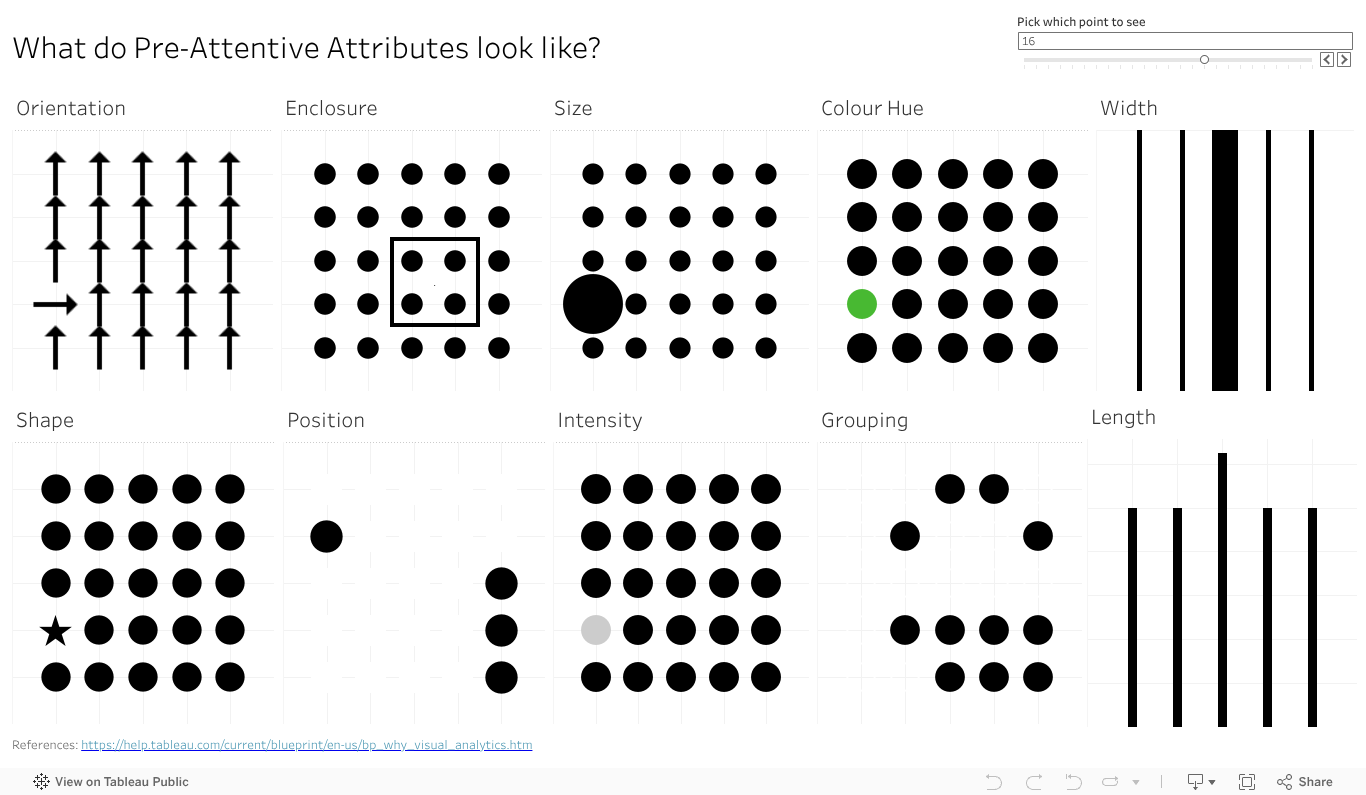
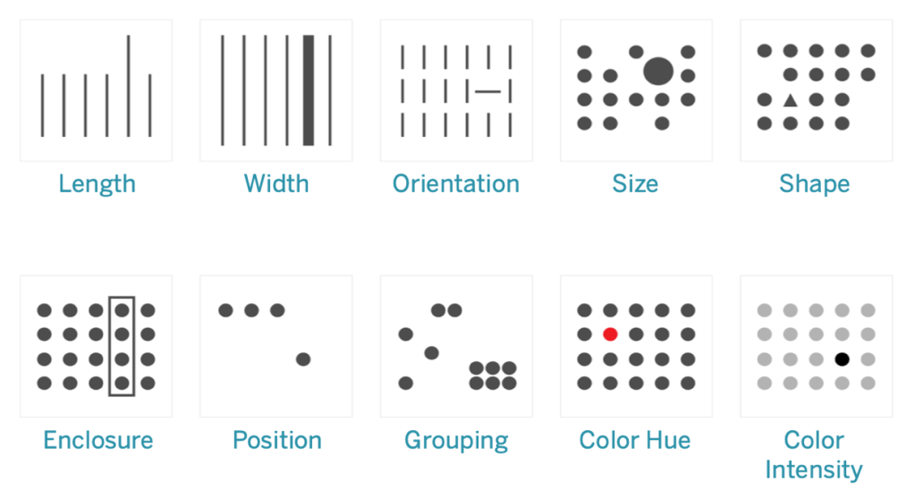
1-Design Dashboards for the Mind’s Eye. This one blew my mind. Truly amazing demonstration of the power of visual processing in the human brain.

2-Iron viz. Wow and tips to learn like crazy. Pata might be a newbie but up there on stage like a Viz Goddess. So many terms and examples highlighted as the build is ongoing through the event.

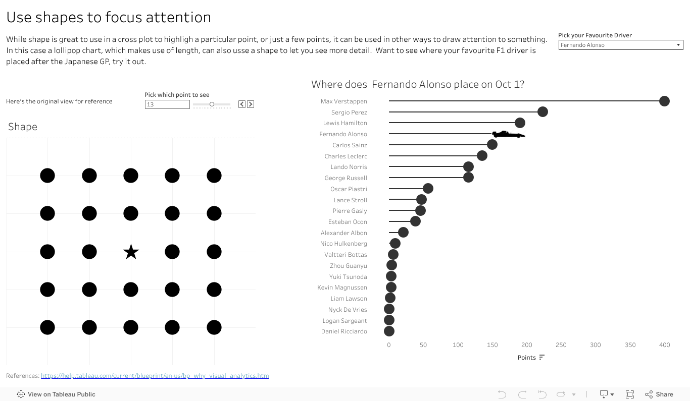
3-How to do cool stuff in Tableau. URL actions and filters – even answered question I had last week. And the online same sizing of the charts via WebEdit. Very cool presentation from the expert twins.

Public Vizs

The Tableau community is fabulous at sharing content, to help others learn and maybe, just maybe, show off a bit. Want to find a wealth of information? Go to the Tableau Public site, use the search bar and search for TC24, TC2024 or Tableau Conference 24 . Vis’s posted for the event, either as content or just in general will be returned. Happy viz surfing. My three favourites are

1-Hours of Sunshine – by Chantilly Jaggernauth. Lovely, simple eye catching viz for hours of sunlight. I like the way the regions are split with top and bottom dots. That can be applied in a few places I can think of now.

2-The Iron Viz – The IMDB Explorer. Just for the arc chart this is amazing. Learning to that will take some time but be hugely useful. Click at the bottom right to get to the arc exploration viz.

3-At the speed of Iron Viz . Check this out for the tips and tricks to make you faster and better. Works best with the Iron Viz video as you get some commentary on the techniques applied and why they can help you out.

That’s my 3X3 highlights of the Tableau Conference 2024 replays. One of my Viz hero’s, Paul Banoub, encouraged me to watch the TC replays nearly a decade ago. I encourage you to take in all the session recordings you can. You will learn, you will laugh, you may cringe, you will be a better vizologist for it. Enjoy.

Pre-attentive Attributes: The Dashboard

Ok, I did it again. I made all the pre-attentive attributes into a dashboard as I veered slightly off track making the baseline data view. I started getting ready to make the first post looking in depth at features, but then the one data viz turned into another one, then another, and another. So I kept going in the flow to almost accidentally make my own reference copy of the pre-attentive features.

I also added a bit of interactivity to it so you can move around (for some) the key feature you want to highlight – like the size, colour or orientation indicator. It also moves the longer and wider bars, just works a bit slower.

VizologyPreAttentiveFeaturesInteractive1
           

Give the dashboard a play, give it a screen grab to use in your presentations if it can help you With a bit of work I could likely give you some options on the colour (that one colour dot).

Something else that will make this more visually compelling and helpful? Let the comments know.

Pre-attentive: Shapes

Can you spot a square in a sea of circles? Or perhaps the stop sign in the deluge of visual information that is city driving? That octagon shape, along with the red, makes it easier to distinguish that important road sign from the billboard, the sign board, the ad for your favourite coffee shop and that traffic light just about to turn red.

But what can we do with that in data viz? Well, you have a few places of course. A shape change to highlight a key point in a cross plot, so long as it’s not too dense, can help you grab people’s attention without changing the colours.

You could have a bit more fun and us the shape element on a lollipop. No, not the kind that you unwrap and suck on, with oh so yummy Coca Cola flavour. No, the lollipop chart – where you typically have a circle atop a narrow bar chart style graph. If you want to limit colours, but still draw in the eye on a particular element, why not change the shape at the top to stand out. Make it a triangle to highlight the one you want. You can use this to add more data in a view , as the lollipop will naturally play to the length pre-attentive feature, so you can have both the ability to showcase the top items fast, and the one you are focused on in relation to them.

PreAttentive-Shapes

I’ve done that with an F1 vis. In 2023 Max has run, well sprinted at record pace away, with the total points for the year. That said there are some interesting battles further down the field. How is Alsono doing? Check out the car shape to fin out. How about newcomer Patrasi?

Length and colour traditionally get the attention in data viz, with bar charts and palettes of so many colours to choose from. Don’t forget the idea of shape in your next dashboard or analytics. Maybe it has a way to grab your audiences eye and inject some novelty to help you make your message stand out.

Data Viz at the Speed of Thought: Pre-attentive Attributes

Do you want your data viz message to reach your audience fast? Want it to get there almost faster than the speed of thought? Dig deeper on a human ability known as pre-attentive attributes.

Just what are they? Why are they there? The why goes back to evolution, when humans didn’t use tools to make charts or navigate the world, they used eyes and experience. And dangers were not limited to 12 slice Pie charts attempting to depict a startling conclusion. Long ago the features let you navigate the world, find the food you needed and avoid the predators that wanted to make you into food. Motion, super easy to see. Bit of the right colour or shape (of say fruit), useful to see. Distilled down for a more modern world, the attributes are ways to organise visual information – not just data but anything – in a way that will bypass conscious thought to be understood in the brain. Needless to say they have huge implications in data viz, but I’ll offer a shout out to Datasaurus-Rex for designing a CV format with pre-attentive attributes in mind.

What do they look like? Commonly shown in the below image, this one borrowed from https://help.tableau.com/current/blueprint/en-us/bp_why_visual_analytics.htm. You can read more there, as well as out ever reliable source of information, Wikipedia https://en.wikipedia.org/wiki/Pre-attentive_processing.

Ten attributes above – looks like an ideal time to start a mini series on how how you can apply the features in data viz, and beyond. Stay tuned as I delve deeper into the features, build up a viz to showcase them all, add details on how you can use each of them in more detail. And of course add some interactivity , after all what’s a data viz without the ability to interact and explore?

As a teaser, a good sample I came across on Tableau Public for you to see some features in action, start your inspirations and ideas flowing. https://public.tableau.com/app/profile/jason.knudson/viz/Pre-AttentiveAttributes_16558437991060/Pre-AttentiveAttributes

Got a favourite feature in mind from the above 10 you’d like to see. Drop a comment on the name to bump it up the list to work on.