Data viz turns abstract data into tangible insights. In my past post I shared an abstract how to make a 100% bar chart with text. Now, I’ve gone and made it real for you. [scroll down, its a ways to the bottom]
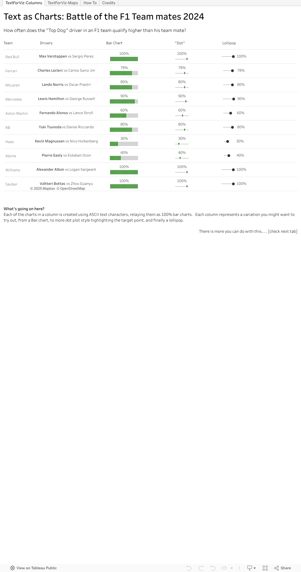
Check out the first tab, where I neatly line up a few examples for you. I took the bar chart idea and thought, what else could we do. Well, why not a Lollipop chart, or variation of. I reckon there are more neat ways out there – hope you will try some.
I popped the view onto a map, second tab, like a geographic overlay. Useful for things the same size, and if you don’t want to fiddle with charts a lot. This can be useful on maps and more.
And best of all, the steps behind the trick. You can see in formula windows the way to extract parts of the text character, then sneak into the text settings on the marks tab to change the colour. Once the colour is changed and the text strings lined up, viola, you have it.
Hope I’ve been able to make the abstract text to chart idea into a tangible for you. Download the workbook if you want to see and try the magic yourself.

Funnily enough, I used that text formatted charts style in a LinkedIn post. Got so many views it blew my mind.
LikeLike