I recently enjoyed a trip back to Japan for some great food, family fun and the occasional historical adventure around the Tokyo area. We stopped at one place for some history, Odawara Castle, in Kanagawa. This castle is often on the list of things to see, partly as it’s a short Shinkansen ride away from Tokyo and , as I learned, it’s fairly historic and one of the tallest in Japan. History wise, it played a role in the 1500s consolidation of Japan being the last major castle to surrender to Toyotomi Hideyoshi. Height wise, as advertised, it’s in the top 10, number 7 in fact. [total side note, nice to know I’ve been to 4 of the 5 highest castles]
Yet the viz eye in me spotted a small problem. Overall it’s a good chart representation- scale at the side but without much overbearing numbering. Good visuals of the castles to attract the eye and a precise and consistent height out to one decimal place for all. The lines on the Y axes are not over bearing, and use gradient and size well between the 10m and 5m increments. All good so far.
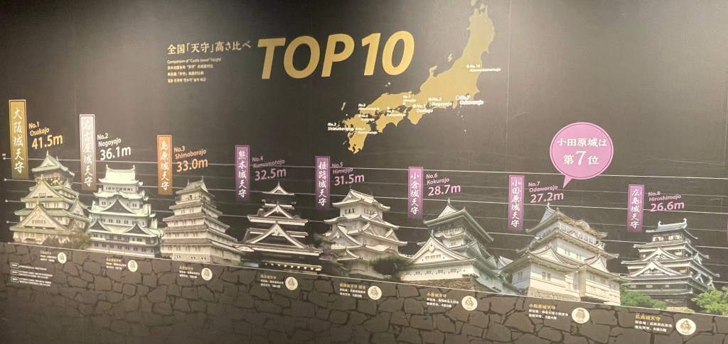
But look closer, really close, at the Y axis lines, for the star castle, Odawara. Listed at a 28.7m height. Doesn’t that very top top of the castle look to be over the 30m line? Pretty close between position 6, 7 and 8 on the charts, yet there does appear to be a bit of Castle Height Inflation going on.
What do you think? Should they redo some graphic sizing to be Viz chart accurate with the axes and all? Or leave it be – it’s telling a story and a little artistic license surely is allowed in your Castle Chart.
