It’s been said before, many times. It will be said again, many times (likely by me) that a Pie Chart is a poor way to represent data. As humans, we are not well evolved to easily and accurately compare the differences in area. This in contrast to how we handle length, where we have a great ability to discern small differences in the length of what we see.
So they start off weak. They then take a turn for the worse in the many ways our computers now let us manipulate them. It’s way too easy to add a bunch of data to a pie chart – exploding the number of slices. Add in colour thanks to a drag and drop and those explodes slices are now multi coloured rainbows (if you are lucky), a wheel of colour death if you are not.
We can use the chart type for evil even more (whether intentional or unintentional) by adding in values that exceed 100%. A pie chart really can only show you the portion of a whole, so when you add in values of percent that add up to 100s of percents, with all those colours and slices, it makes the head hurt.
So they can go wrong. They can though help tell a story. If you don’t need a kaleidoscope of colour or more slices than clouds in the sky to make your point, there is hope for a pie chart (and if you do need the slices and lines, you need another chart type, or more than one).
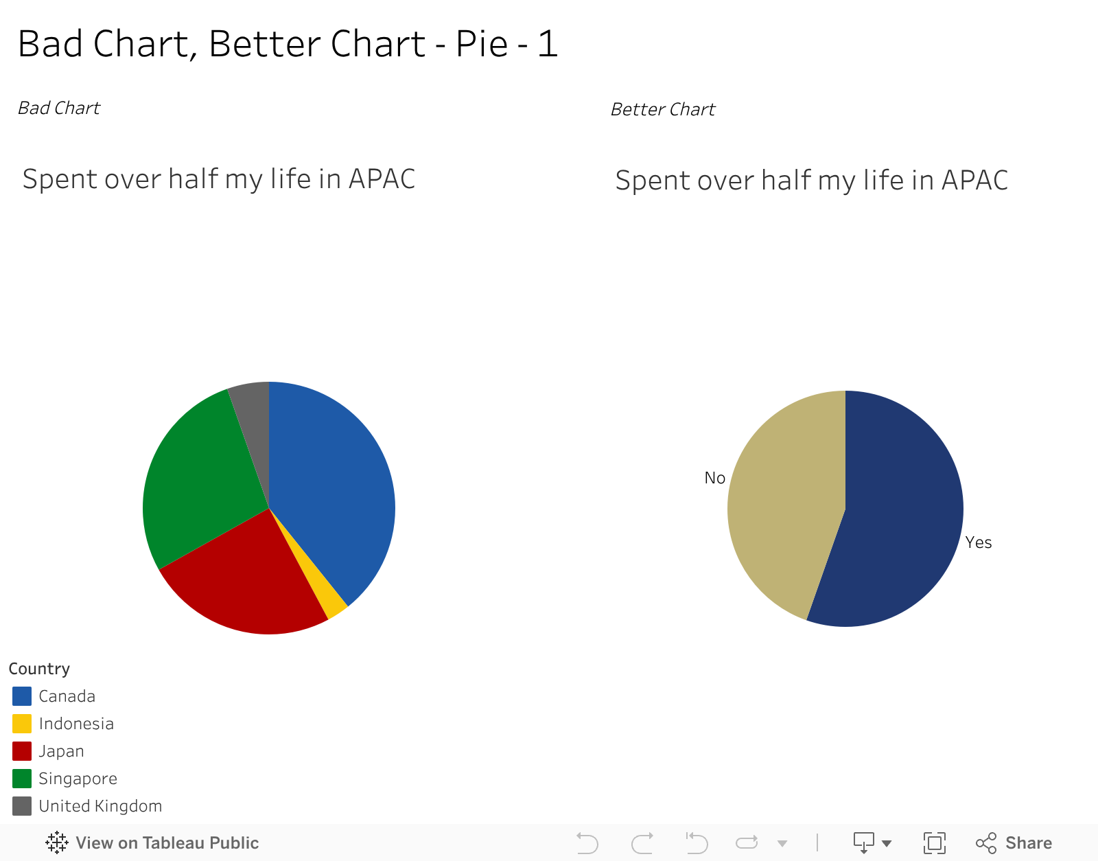
An example of one I might use for effect. For context, I was born in Canada but spent more than half my life in Asia Pacific How can I easily explain that to someone? Well, I do keep data and have some charts as above – one on all the places I’ve lived and about for how long. And one on the right on how much of my life has been spent in Asia. I would never subject anyone to the multi slide one except for educational purposes, yet the two colour one could fit a visual resume or presentation. It says, and only needs to say, I’ve spent more than half my life in Asia. I don’t need you to know if its 55.2% or 54.7% , nor where those years accumulated. Just that simple bit of a story.
And for that, while pie charts are less than great, I think the one on the right is a better chart than where it started.
