Ok, I did it again. I made all the pre-attentive attributes into a dashboard as I veered slightly off track making the baseline data view. I started getting ready to make the first post looking in depth at features, but then the one data viz turned into another one, then another, and another. So I kept going in the flow to almost accidentally make my own reference copy of the pre-attentive features.
I also added a bit of interactivity to it so you can move around (for some) the key feature you want to highlight – like the size, colour or orientation indicator. It also moves the longer and wider bars, just works a bit slower.
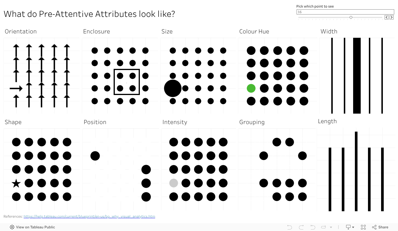
Give the dashboard a play, give it a screen grab to use in your presentations if it can help you With a bit of work I could likely give you some options on the colour (that one colour dot).
Something else that will make this more visually compelling and helpful? Let the comments know.
