Can you spot a square in a sea of circles? Or perhaps the stop sign in the deluge of visual information that is city driving? That octagon shape, along with the red, makes it easier to distinguish that important road sign from the billboard, the sign board, the ad for your favourite coffee shop and that traffic light just about to turn red.
But what can we do with that in data viz? Well, you have a few places of course. A shape change to highlight a key point in a cross plot, so long as it’s not too dense, can help you grab people’s attention without changing the colours.
You could have a bit more fun and us the shape element on a lollipop. No, not the kind that you unwrap and suck on, with oh so yummy Coca Cola flavour. No, the lollipop chart – where you typically have a circle atop a narrow bar chart style graph. If you want to limit colours, but still draw in the eye on a particular element, why not change the shape at the top to stand out. Make it a triangle to highlight the one you want. You can use this to add more data in a view , as the lollipop will naturally play to the length pre-attentive feature, so you can have both the ability to showcase the top items fast, and the one you are focused on in relation to them.
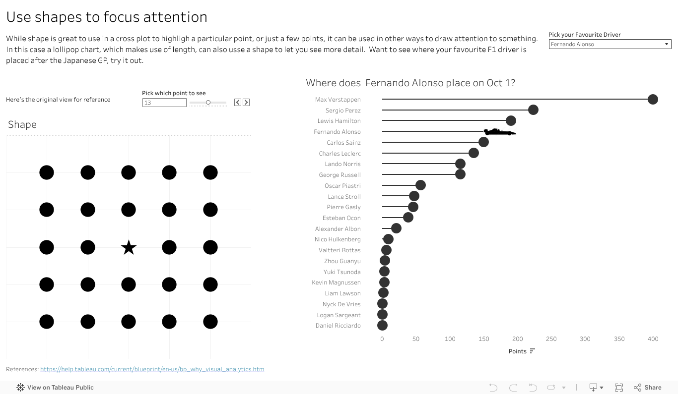
I’ve done that with an F1 vis. In 2023 Max has run, well sprinted at record pace away, with the total points for the year. That said there are some interesting battles further down the field. How is Alsono doing? Check out the car shape to fin out. How about newcomer Patrasi?
Length and colour traditionally get the attention in data viz, with bar charts and palettes of so many colours to choose from. Don’t forget the idea of shape in your next dashboard or analytics. Maybe it has a way to grab your audiences eye and inject some novelty to help you make your message stand out.
