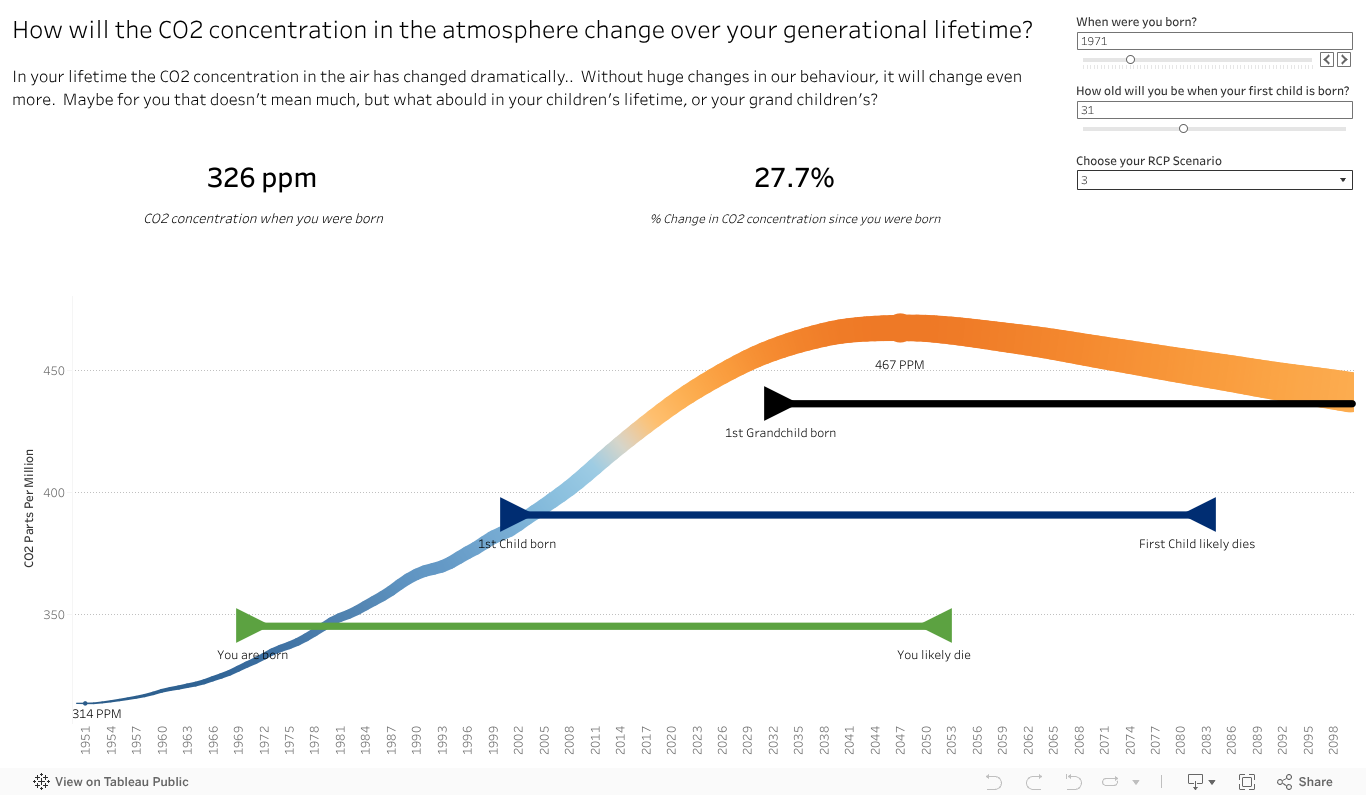
I started working on a viz a while back, inspired by a print version in a book called Nomad Century. It showed the change in CO2 in the atmosphere from the authors lifetime perspective, with a view to future generations. I liked it. So I took it and ran with it to make it more interactive and specific to my view. Interactive so people could choose their relative ages, make some assumptions on lifespans to look ahead at, and choose from some of the various climate perspectives forecast. I like to make things interactive so people can play and explore the data, and as a father, this was one that could show me more of the future perhaps than a number for CO2, or mere words.
It took a while to get the data, it took longer to get a view that I was semi happy with to show what I wanted. And what I wanted to show was the life cycles of three generations, yourself, kids and grandkids , to show the climate impact forecasts, the scale of change that has occured over a lifetime and to let people see where the climate impact landed on different scenarios. I wished I could show the temperature forecast over time, but made due with the CO2 concentration.
Fiddling along, I managed to get a Gantt chart style view for people, and the line for CO2. As the title betrays, it’s far from what I want to be as a completed viz(super draft is not even 1st draft). I’ll share it here because……
A while after I stopped playing with the viz, to tackle some others, a very similar and better done viz was released with the IPPC 6, You can see it here, and the full link below.
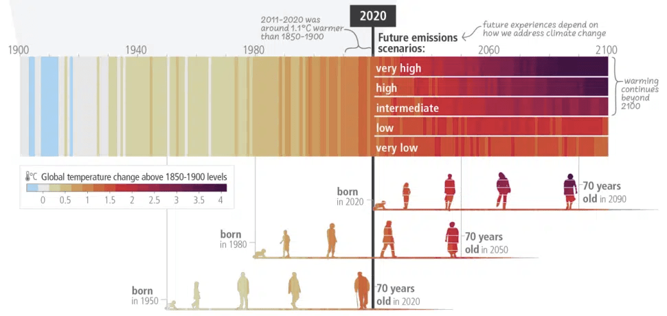
I love how they added the icons on the bar to show the ages. I like my timeline and its ability to personalise, but it lacks impact. I love their ability to make it more human with the images over time. The climate bars, showing heat from historic benchmark, and the different scenarios at the top right bring home the point that unless we reduce drastically, it’s going to be hot for our grandchildren. To me it’s not quite there yet. It’s missing still something, like mine, to connect the increase in temp/CO2/colour bar to what it means (sea level rise, droughts etc). That said, it’s a great viz and I shall certainly look to borrow those icons for people.
Stay tuned for another version of my viz on the climate change. Getting people to think beyond their ages is important to making change and I can’t help but feel there is more than one way to viz this.
That said, felt very happy to see someone viz something in a similar way. I’ll take that as a complement for (at least hoping to be) great minds thinking alike.
Below the link to the full story, including the viz used above.
